Embedding Figma into your Dev Environment

We have often been faced with the problem of designs changing or being modified or developers not making the component exactly how the designer requested. When designs live in one place and component files in other it is often hard to keep things in sync. And once the component has been built the developer will probably never even open the designs again.
But what if we could create a better experience? What if we could add the designs directly into the developers working environment and have those designs update in real time!
With Bit and Figma that is exactly what you can do. Let me show you.
Update Design - See Changes in your dev Environment#
Figma Embeds#
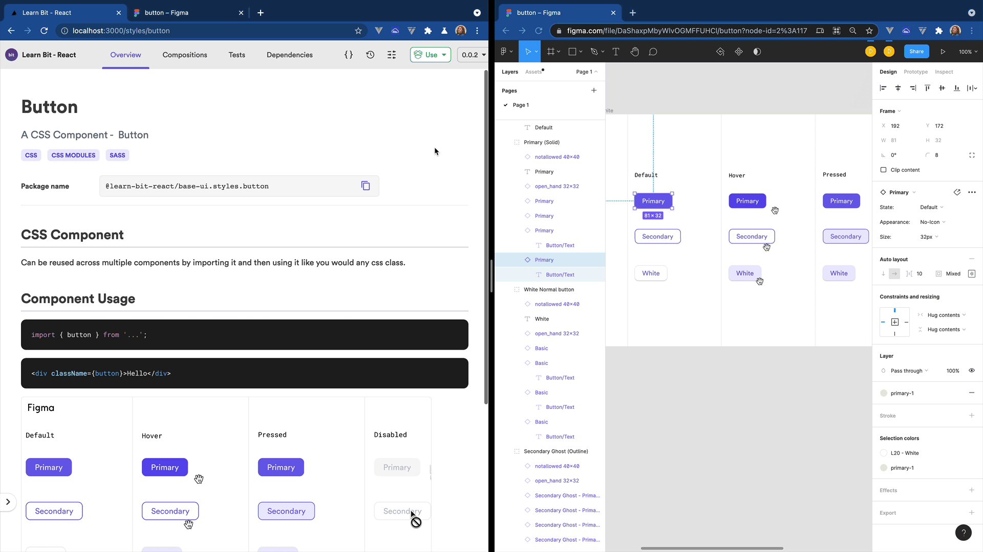
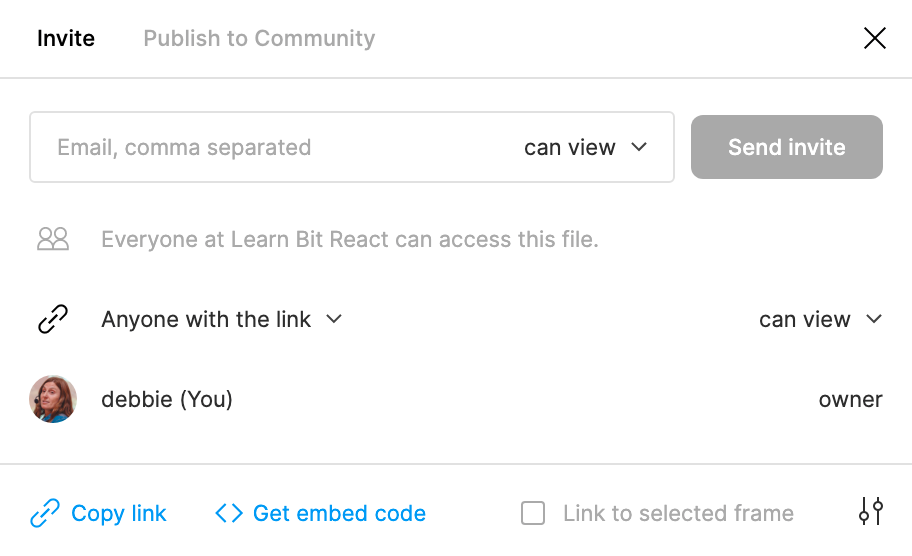
Figma is of the most used tools for designers today and it is what we use at Bit. When a designer creates a component in Figma all we need to do to add this to our Bit component is use the share button in Figma which is located at the top right in the header. Then click on the 'Get embed code' link. This will give you an embed code that you can then use to embed directly into your docs file. If you have more than one file on the canvas you can select the 'link to selected frame'. This will embed only the selected frame(component) and not the whole canvas.
Figma allows us to choose the permissions we want to give for this file, to be visible to anyone or just members on our team. As Bit is an open source product we have left our designs open for anyone to see them.
Figma and Bit#
There are of course other options for adding the Figma embed such as creating a new tab in your workspace and adding the Figma file there. However I quite like the dev experience of adding it to the components docs file as the compositions are shown just below the docs in the overview tab of Bit and that means I get to see design and composition of my component right next to each other. It is a much better developer experience and also much better for review purposes too. However for more complex designs such as complete app components it might make more sense to add the Figma file to a new tab instead of in the docs.
As our docs uses mdx we can literally just paste the embed code here.
<iframe style="border: 1px solid rgba(0, 0, 0, 0.1);" width="800" height="450" src="https://www.figma.com/embed?embed_host=share&url=https%3A%2F%2Fwww.figma.com%2Ffile%2FDaShaxpMbyWlvOGMFFUHCl%2Fbutton%3Fnode-id%3D0%253A1" allowfullscreen></iframe>However we will need to modify the styles to use brackets instead of quotes.
<iframe title="button.docs.mdx" style={{ border: '1px solid rgba(0, 0, 0, 0.1)' }} width="800" height="450" src="https://www.figma.com/embed?embed_host=share&url=https%3A%2F%2Fwww.figma.com%2Ffile%2FDaShaxpMbyWlvOGMFFUHCl%2Fbutton%3Fnode-id%3D0%253A1" allowfullscreen></iframe>Figma Live Embed in Bit Component's Docs#
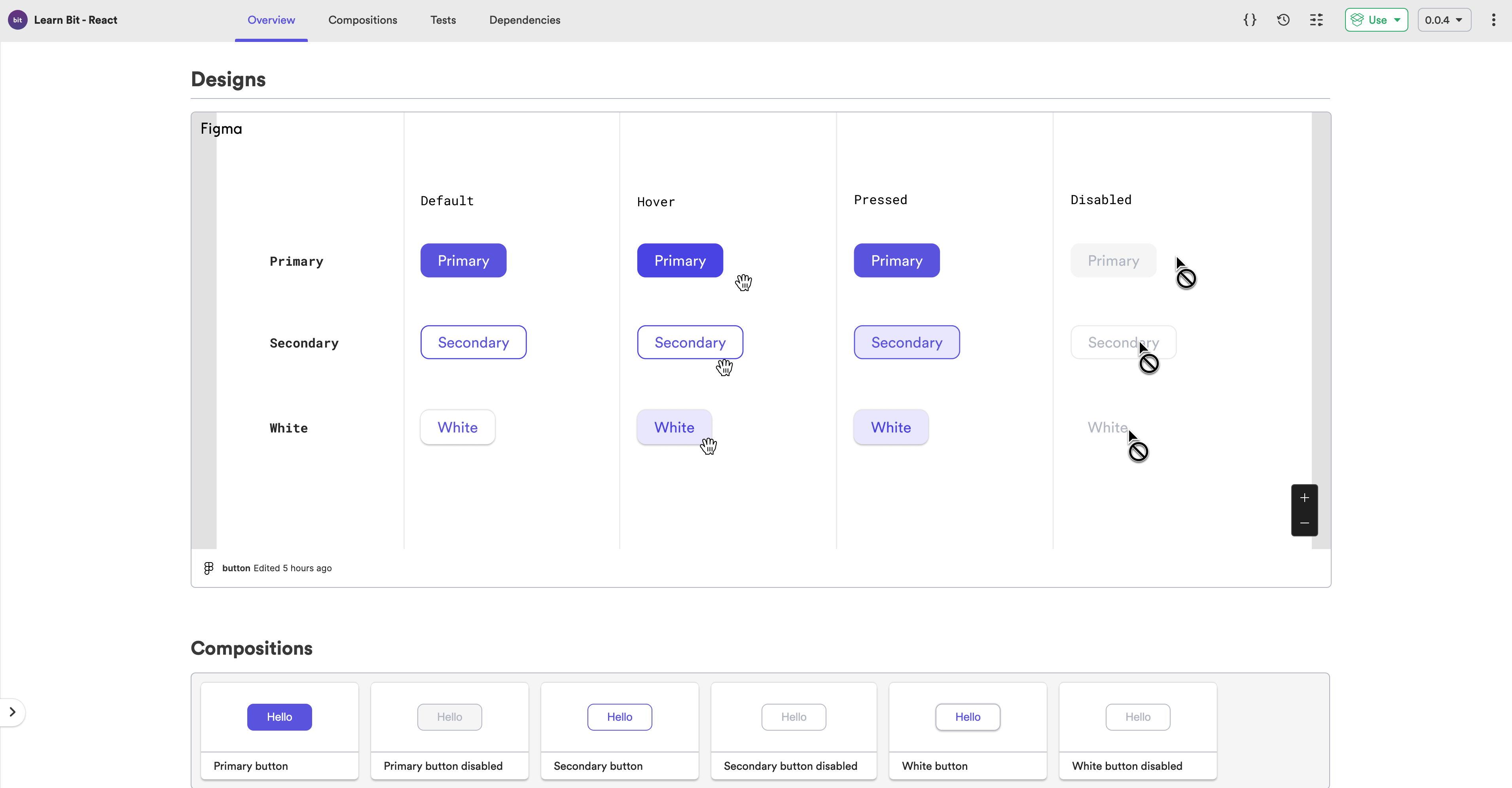
This will work perfect and you will now see in your overview tab that you have your Figma file embedded in your docs. This means that the developer can now start to developer the component based on the designs and can easily click on the link to open the Figma file to better inspect the component designs. The developer then starts creating the various compositions needed for this component and once finished they can export the component and send the link to the designer and project manager for approval.
Create a Figma Component#
We can improve this further by creating a component for our Figma embed so that we add more styles or modify the width and height. This will make it easier to manage when we add further Figma embeds. We can also add a height and width attribute with default value which will allow the consumer to override it should they need to.
Lazy Loading our iframes#
We can also add lazy loading for our iframe which is fully supported in Chrome and Chromium-based browsers. This will defer the offscreen frame from being loaded until the user scrolls near to it which reduces memory usage. This is especially helpful for when adding Figma embeds to all our components as sometimes you might not scroll down to see the Figma file or might not need it and it will give users a much better user experience.
loading = 'lazy';Figma Embed Component#
import React from 'react';import classNames from 'classnames';import styles from './figma-embed.module.scss';
export type FigmaEmbedProps = {  /**   * src for figma embed. Click on Share button in Figma and click on 'Get embed code' and then copy the value of the src attribute from the iframe.   */  iframeSrc: string,  /**   * add lazy loading   */  loading?: 'lazy' | 'eager',  /**   * width of iframe   */  width?: string,  /**   * height of iframe   */  height?: string} & React.HTMLAttributes<HTMLIFrameElement>;
export function FigmaEmbed({ iframeSrc, loading = 'lazy', width = '100%', height = '600', className}: FigmaEmbedProps) { return ( <iframe className={classNames(styles.iframe, className)} width={width} height={height} src={iframeSrc} loading={loading}></iframe> );}Using your Figma Component#
You can now use your Figma Component in any of your component docs by just changing the src of the iframe. You can also modify the height, width, styles and lazy loading if you wish or just use the default values.
<FigmaEmbed iframeSrc="https://www.figma.com/embed?embed_host=share&url=https%3A%2F%2Fwww.figma.com%2Ffile%2FDaShaxpMbyWlvOGMFFUHCl%2Fbutton%3Fnode-id%3D0%253A1" />