Build and Share React Components

Let's get started with Bit and create a component that consumes another component, version and export it to the cloud and then use it in a React application.
Install Bit#
To use Bit we first need to install it BVM, Bit's version manager.
npm i -g @teambit/bvmOnce BVM has been installed we can then use it to install Bit
bvm installYou can check that Bit has been installed by running the bit --version command. If you run into any issues while installing then check out our Using BVM guide as you may need to configure the PATH global variable.
Initialize a Workspace#
Next we need to initialize a new Bit harmony workspace as we want to use the harmony version of Bit. It is best to initialize a workspace in an empty directory using Git for version control.
git initbit init --harmonyThis will give us a workspace.jsonc file, which is our main configuration file for our workspace, a .bitmap file, which is an auto generated file that maps your components when they are added to the workspace and a .bit directory, which is normally located in the .git folder when using Git. This folder should be ignored by git whereas the workspace.jsonc file and the .bitmap file should be version controlled.
Installing Dependencies#
First we will need to run the bit install command to install all needed dependencies.
bit installAs we are going to be creating a React workspace we need to install react and react-dom as peerDependencies. Peer dependencies provide the details of what the host application is expected to provide.
bit install react --type peer & bit install react-dom --type peer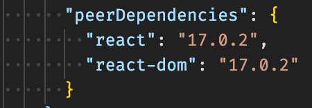
Configuring the Workspace#
The workspace.jsonc file is how we configure everything for our workspace. You can change the name and icon to personalize the workspace for your team or org.
The default scope is set to 'my-scope'. We will need to change this later when we have set up our scope so that we can export our components to the correct scope.
The variants sections is how we set up our environments. Here we need to uncomment the line for React so that all our components are setup using the react environment and not the default environment which is Node.
"teambit.workspace/variants": { "*": { /** * uncomment to apply the react environment on all components. **/ "teambit.react/react": { } }}In this example we are using the wildcard to select all components but you can have as many variants as you need and select only specific directories or omit directories. See the variants docs for more details.
Creating Components#
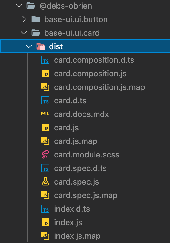
When creating a component Bit requires that all the component files are contained within it's own directory and exported using an index file. Files contained in this directory should include the components code as well as tests, docs, compositions and styles if needed.
In order to make this easier we have created a generator that generates these files for you so all you need to do is decide the name for your component and the namespace. In the example below we are creating a component called button in the ui namespace.
bit create react-component ui/buttonWe now have a button directory with various files inside. Let's take a quick look at what was created.
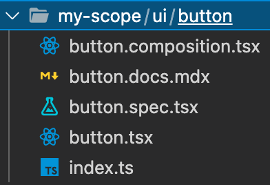
Component File#
The button.tsx file contains the code for the button. It is just a <div> with a text inside as the generator only gives us an example but from here we can modify this component to do whatever we want it to do, which we will do later. Notice the comments in the props. These are important to add as they are then shown in the workspace UI under the properties tab and will make it easier for others to understand your component and how it should be consumed.
import React from 'react';
export type ButtonProps = {  /**   * a text to be rendered in the component.   */  text: string,};
export function Button({ text }: ButtonProps) { return <div>{text}</div>;}Composition File#
The button.composition.tsx file contains our compositions. This imports the button component allowing us to see what it looks like. We can add various compositions here such as a primary button composition and secondary button composition.
import React from 'react';import { Button } from './button';
export const BasicButton = () => <Button text="hello from Button" />;Test File#
The button.spec.tsx is how we test our component. We are importing from the compositions file as we want to test our various compositions such as testing if the button is a primary button or a certain prop has been passed.
import React from 'react';import { render } from '@testing-library/react';import { BasicButton } from './button.composition';
it('should render with the correct text', () => { const { getByText } = render(<BasicButton />); const rendered = getByText('hello from Button'); expect(rendered).toBeTruthy();});Our component is using the React Testing Library therefore we will need to install it so that our tests can run.
bit install @testing-library/reactDocs File#
The button.docs.mdx file is where we document our component. We can modify the description of our component and labels to better categorize our component which is used when searching for components. As it is an mdx file we can import our component and then use the live playground feature to show consumers of our component how to use it and let them play with the component and change things live to see it render with their changes.
---description: 'A Button component.'labels: ['label1', 'label2', 'label3']---
import { Button } from './button';
## React Component for rendering text
A basic div that renders some text
### Component usage
```js<Button text="hello from Button" />```
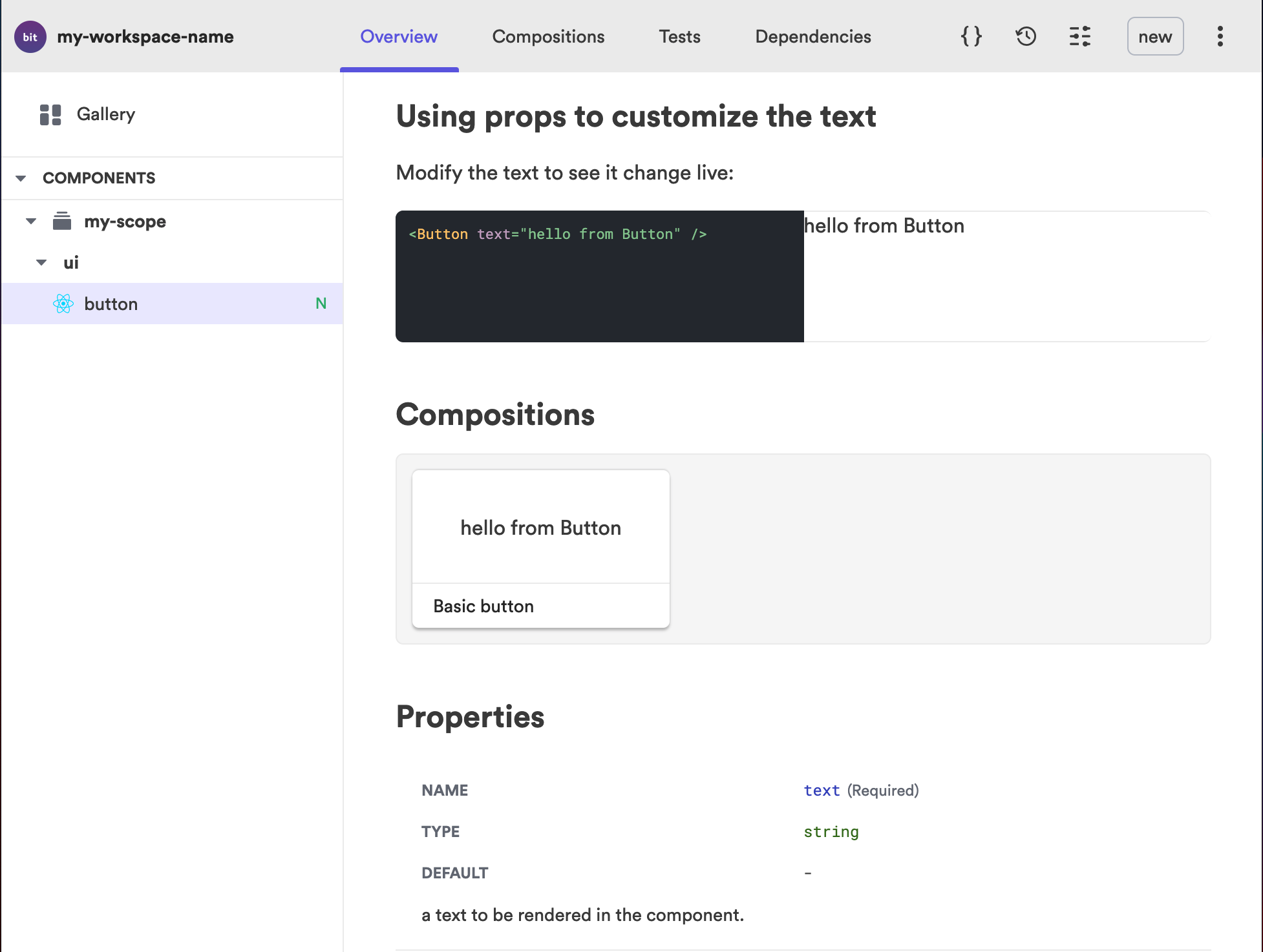
### Using props to customize the text
Modify the text to see it change live:
```js live<Button text="hello from Button" />```
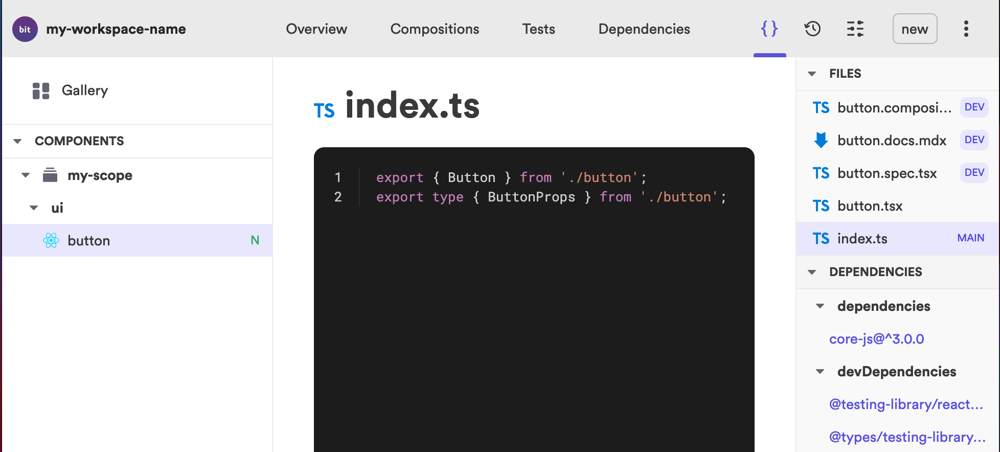
Index file#
The index.tsx file exports the component. Here we use named exports to export both the component and it's props.
export { Button } from './button';export type { ButtonProps } from './button';Start server#
Before we start let's make sure our component will work by running the bit status command.
bit status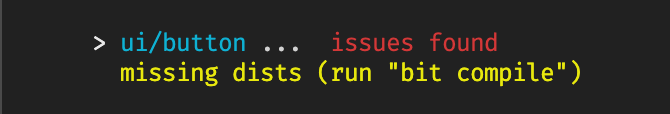
In order to fix the issues found we can run the bit compile command which will compile our component and create the missing dist folder.
The start command starts our dev server, compiles our component and watches for changes using Hot Module Replacement. It runs different workspace tasks through workers, such as testing, linters and any workspace tasks that are defined by the component.
bit startExploring the UI#
The first time we run this command it will take a bit of time to load as it is building the whole UI which contains not just your one component but lots of other interesting things which we will explore below.
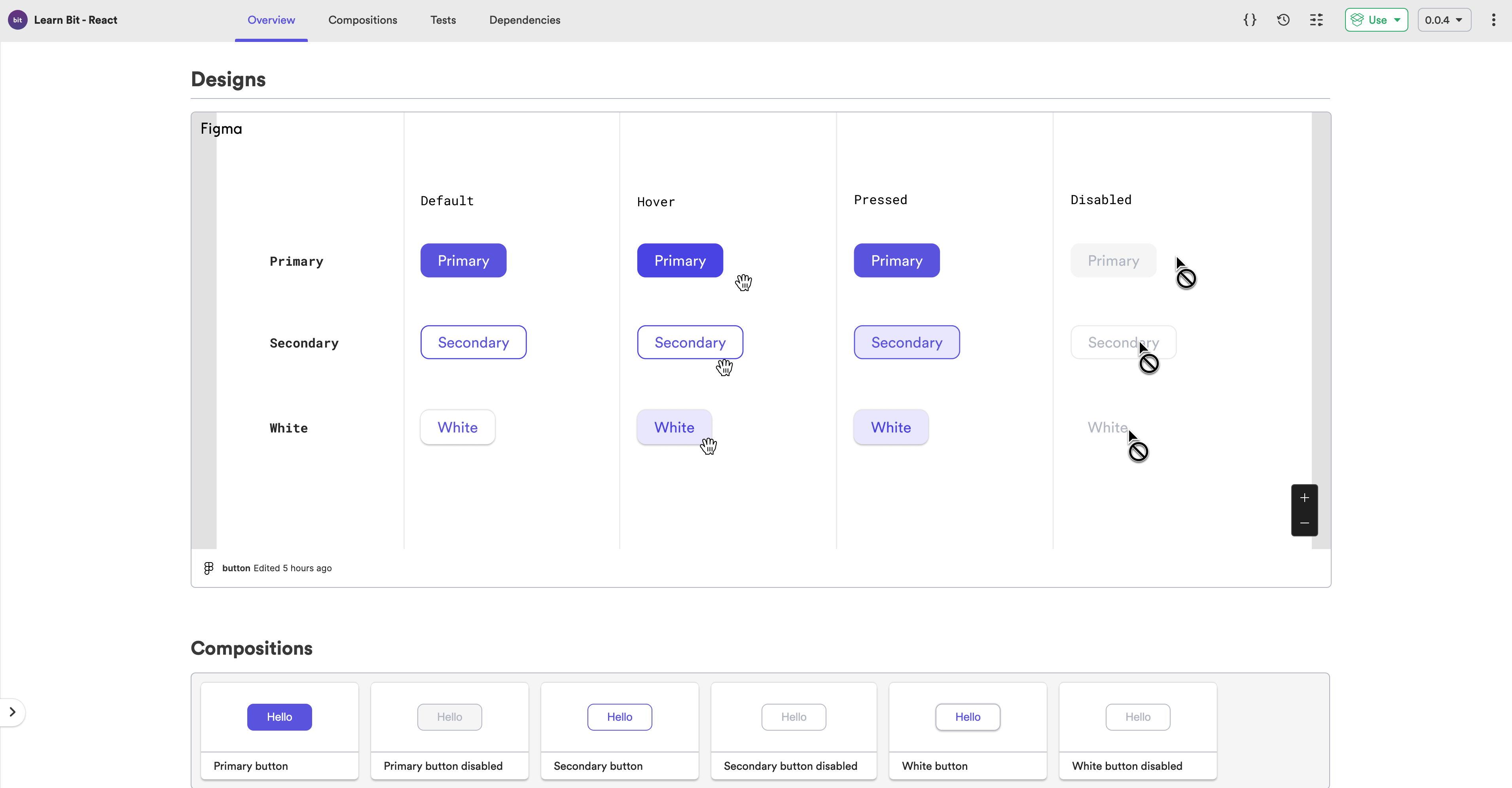
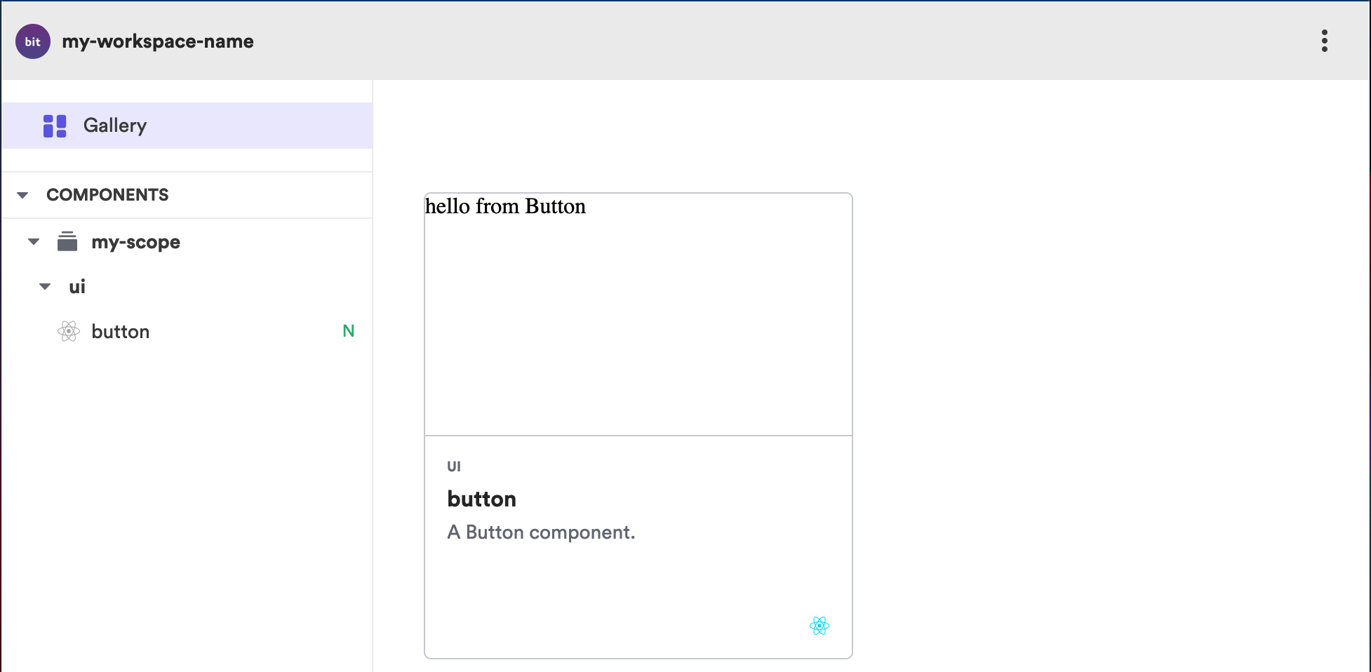
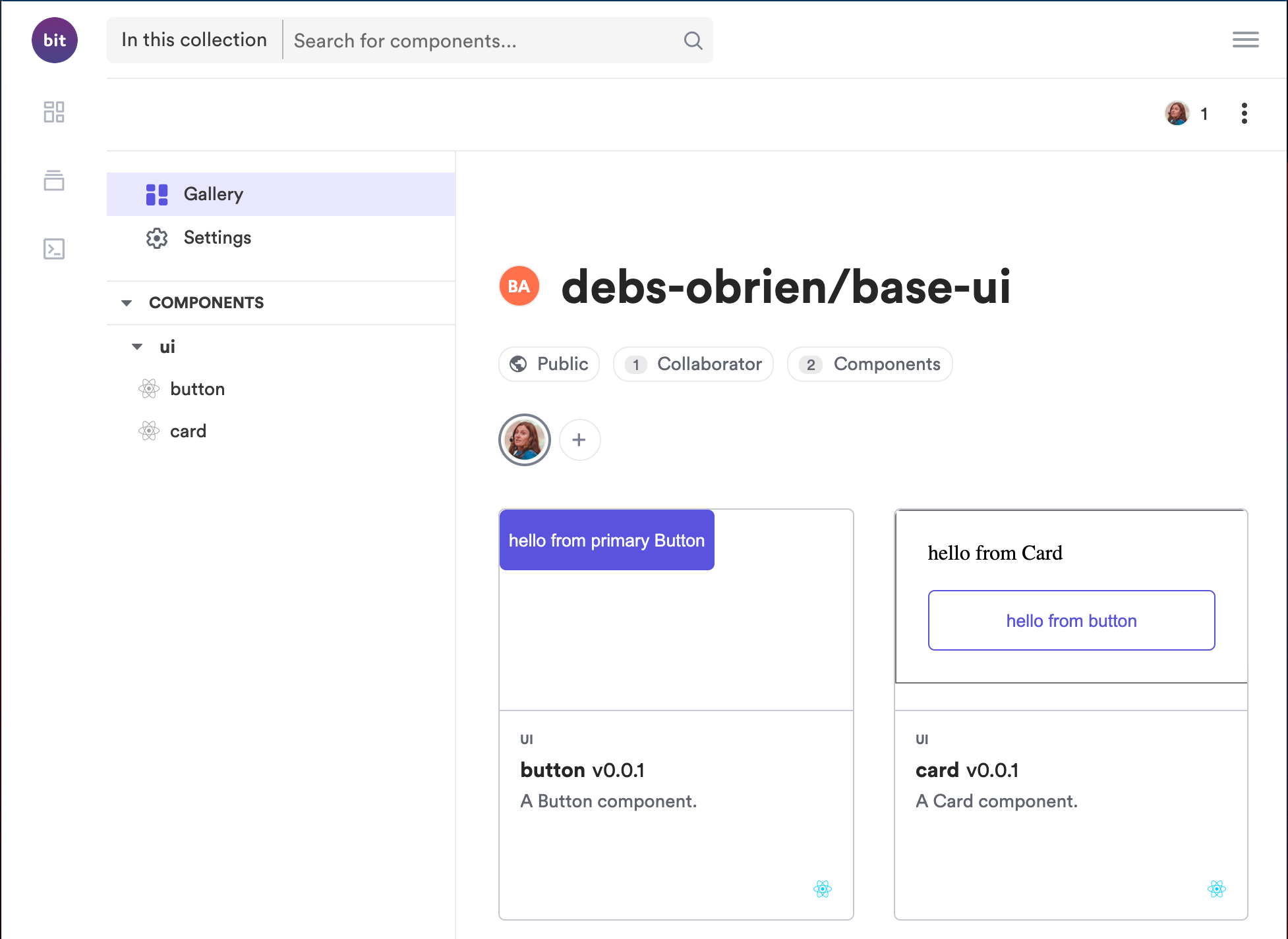
Gallery Overview#
The Gallery page contains a gallery of all our components. In our case we only have one. We can also see a preview of our component.
Overview Tab#
Clicking on the component will open it on the overview tab which is made up from our documentation file. As our documentation includes a live playground you can modify the text and see it change live. This is just a simple example and therefore not very exciting but can be very useful for more complex components where you can live change various props and see how the component will look.
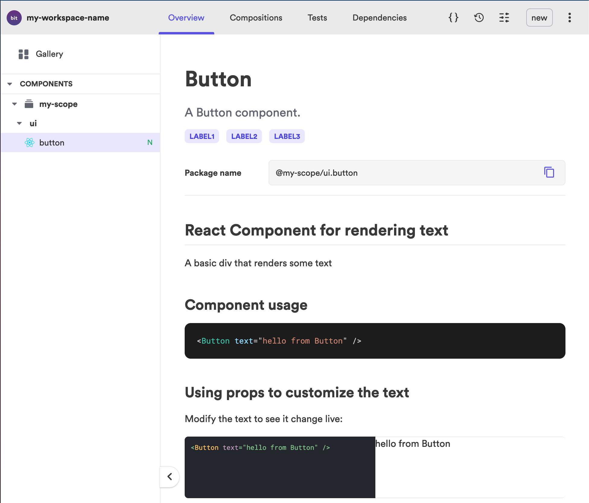
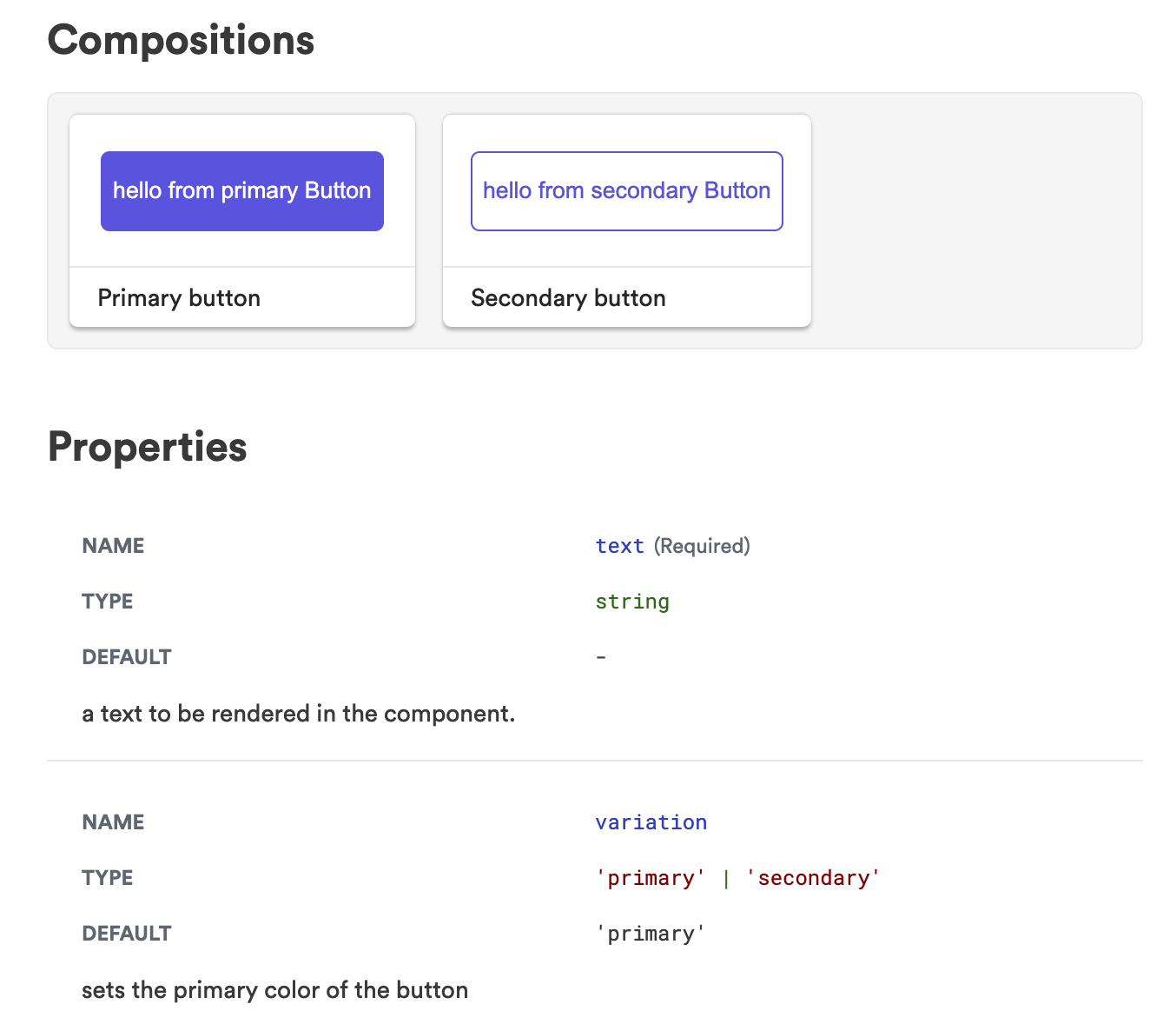
The overview tab also includes the compositions and the properties of your component. These properties are taken from the comments in your components props.
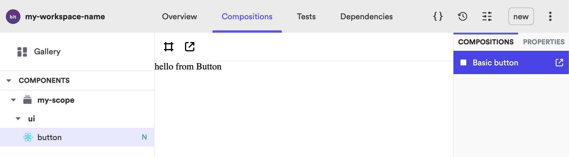
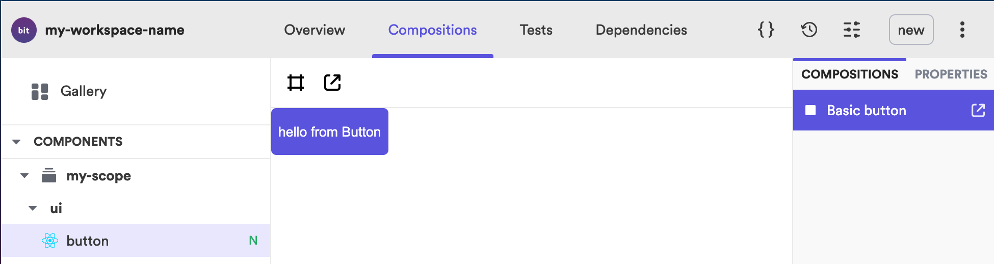
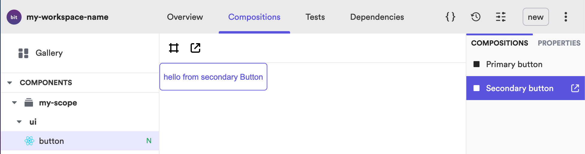
Compositions Tab#
The compositions tab is where you see your component in isolation and if you have various different compositions you would see a list of them on the right and would be able to click on which ever one you want to see. You will also notice an icon above the composition which allows you to open the component in full screen mode so that you can visualize the component outside of the workspace UI.
Tests Tab#
The tests tab shows us if our tests are passing or failing. As we are running the local dev server if we modify our test and make it fail this will automatically change to red and show your test has failed. This means you don't have to run any test command in the terminal in order to see if your tests are passing or failing as you can see them direct in the UI.
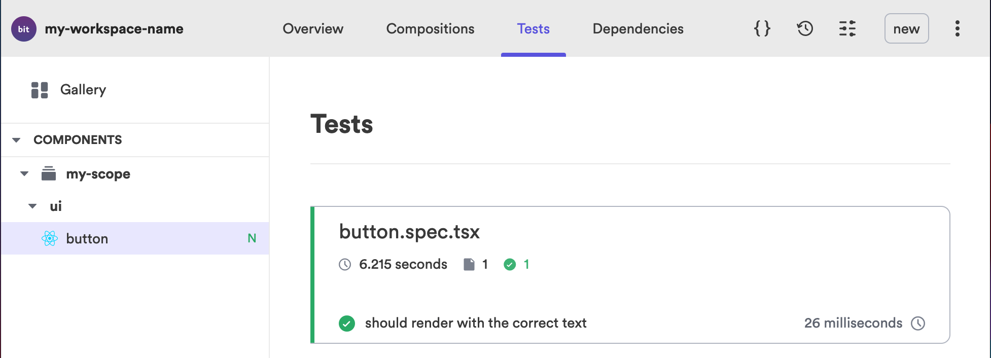
What is important to note here is that if your tests have failed and you try to export your component then you will see a message in the terminal and you won't be able to export your component until the tests have passed. This encourages developers to write tests, therefore encourages best practices.
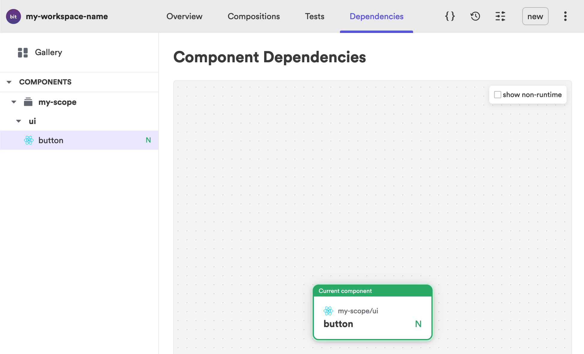
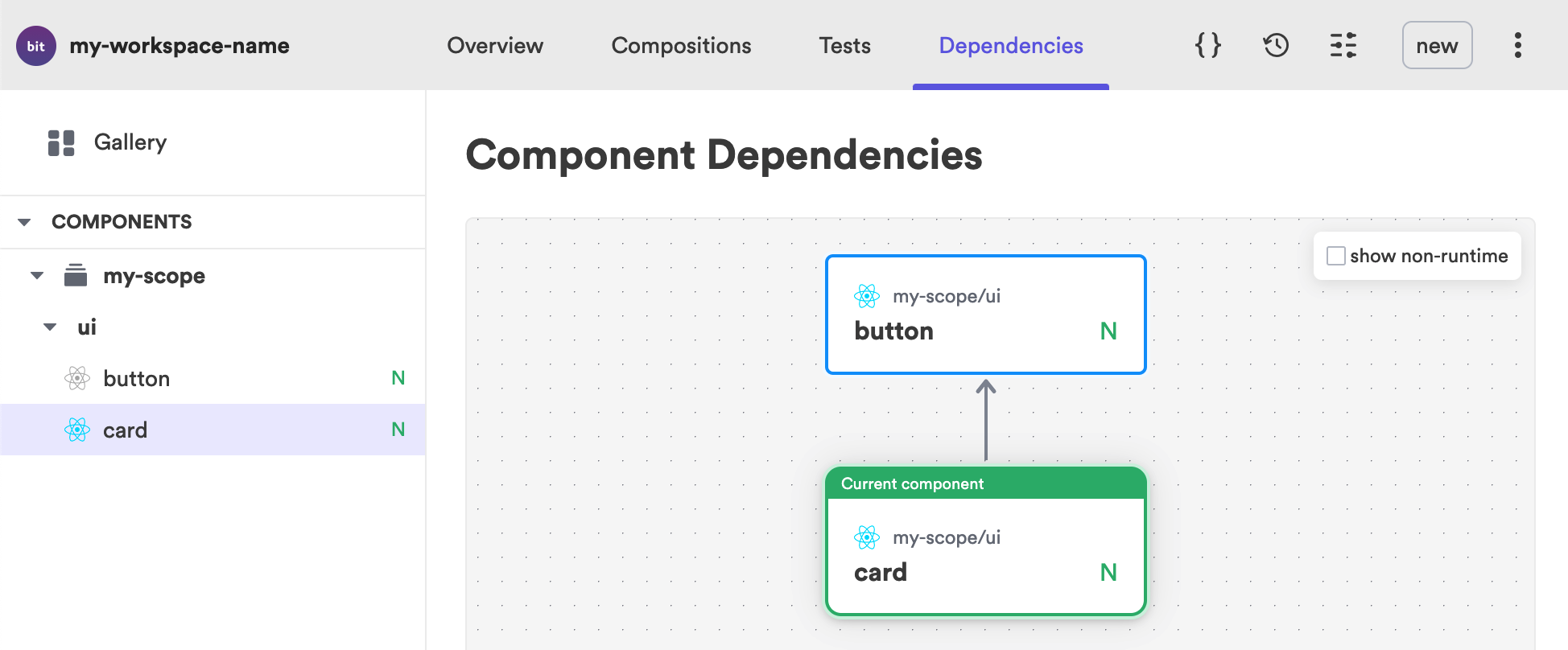
Dependencies Tab#
The dependencies tab shows your component dependencies. As our component doesn't depend on any other component there isn't much to show here but once we start composing components from other components then this graph becomes very useful.
Code Icon#
Over to the right of the UI you will also see some icons. The code brackets show us our components code. This can be very helpful when components are exported as then code can be easily checked without having to open a code editor. A consumer of your component might want to see the code before they consume it. It can also be helpful for bug fixing or getting feedback on your code.
You will also notice under the list of component files it shows you the component dependencies. This will show you other components it depends on as well as packages such as testing library etc.
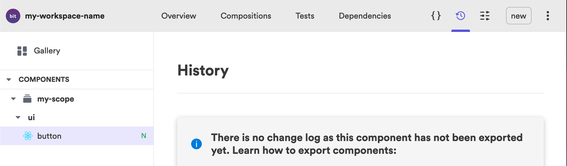
Changelog Icon#
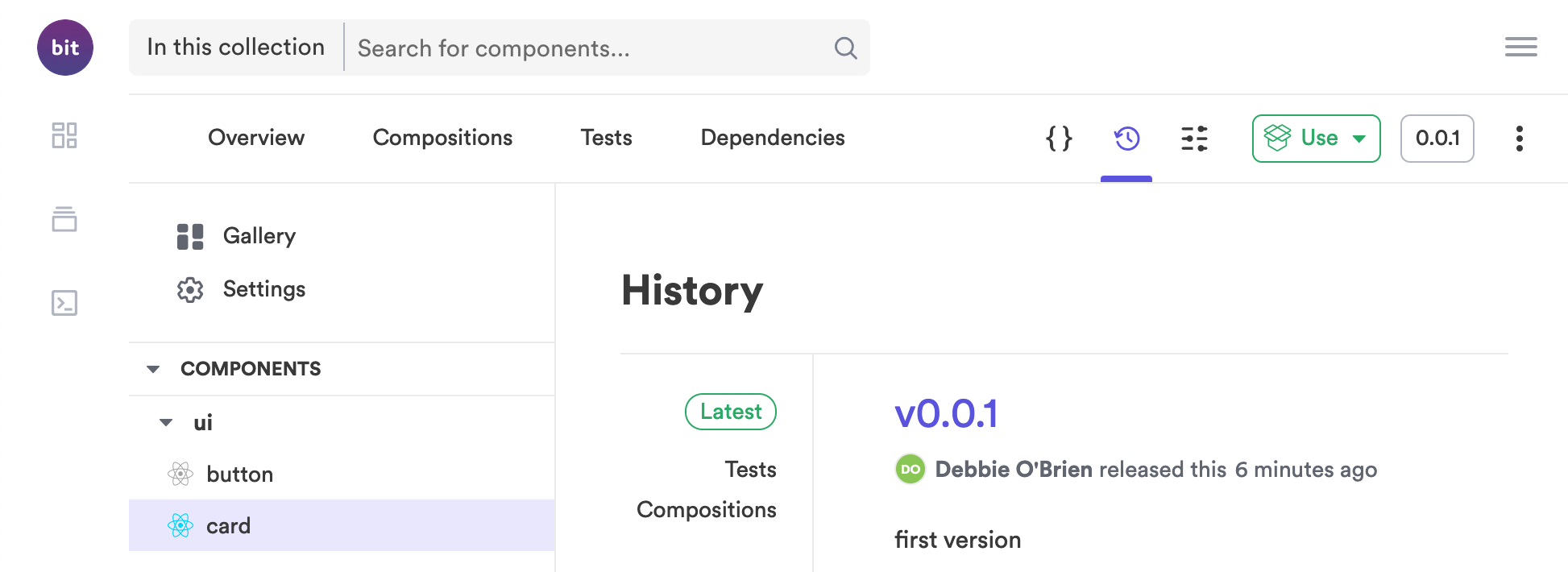
As we have not yet exported our component this tab will show you instructions for how to export. Once your component has been exported then you will see a list of the component versions here and any messages that have been committed when the component was versioned.
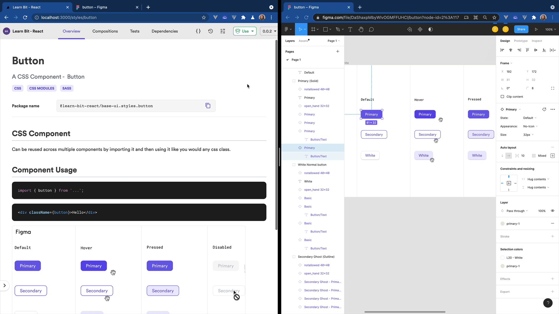
Styling the Component#
It's time to modify our component and turn it into a real button. First we can change the <div> element to be a <button> element and then we can add some basic styling for our button. We will use CSS modules for local scoping but with an SCSS extension so we can use Sass for nesting.
As we want to show a primary and secondary variation of our button we will use the HTML data attributes which allows us to store information on HTML elements. We will need to also add the data-attribute to our button element so that we can use this it to style the button with the primary and secondary variations.
.button {  border-radius: 5px;  height: 46px;  text-align: center;
  &[data-variation='primary'] {    color: white;    background-color: #6c5ce7;    border: 1px solid #6c5ce7;
    &:hover {      border: 1px solid #6c5ce7;      background-color: white;      color: #6c5ce7;    }  }
  &[data-variation='secondary'] {    border: 1px solid #6c5ce7;    background-color: white;    color: #6c5ce7;
&:hover { border: 1px solid #6c5ce7; background-color: #6c5ce7; color: white; } }}To use our styles on our button we need to import the file and then we can use it by referring to styles.button as className.
Importing the styles#
import styles from './button.module.scss';You may notice a warning in vscode saying it cannot find the css module or its type declarations for this file. Feel free to just ignore this warning. (OR - add a d.ts file for scss in the root of the project so the IDE reads it and does not scream at you on missing types):
declare module '*.scss' { const content: { [className: string]: string }; export = content;}Setting the variation#
We can then set a prop of variation with the optional values of primary or secondary. When we pass down our prop we can give it the default value of primary meaning if the consumer doesn't add a variation for the button it will default to the primary variation. We then add our className passing in our button class from the styles we just imported. And in order for it to work we need to add our data-variation passing it the value of the variation prop we created.
We should also modify the text prop to be something more explicit so we don't have any issues later if we have another prop called text. Let's change it to buttonText.
import React from 'react';import styles from './button.module.scss';
export type ButtonProps = {  /**   * a text to be rendered in the component.   */  buttonText: string,  /**   * sets the primary color of the button   */  variation?: 'primary' | 'secondary',};
export function Button({ buttonText, variation = 'primary' }: ButtonProps) { return ( <button className={styles.button} data-variation={variation}> {buttonText} </button> );}As we have the dev server running we can check how our component looks on localhost:3000.
Creating Compositions#
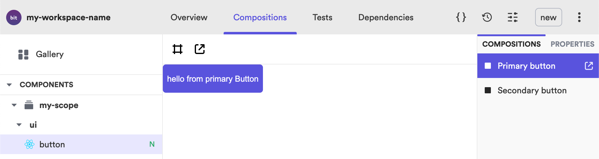
We can now create another composition for our secondary button. First let's rename our BasicButton to PrimaryButton as this is the name that will be shown in the UI for our composition. We don't need to add a variation prop to the primary button as we already set a default value of primary. We can then copy and paste this composition and rename it to SecondaryButton and pass in the variation prop with the value of secondary.
export const PrimaryButton = () => (  <Button buttonText="hello from primary Button" />);
export const SecondaryButton = () => ( <Button variation="secondary" buttonText="hello from secondary Button" />);Now in our local workspace you will see we have 2 compositions and in the compositions tab we can select between our primary and our secondary button.
The overview tab will now show us our Button compositions as well as the new props of variation with the type and default value.
To improve our documentation we can update the live code block with secondary button example making it easier for our consumers to play around with the props and see the buttons change.
```js live<button variation="secondary" buttonText="hello from secondary Button" />```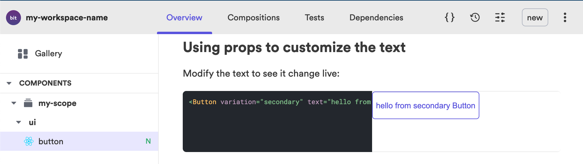
As we have modified our compositions you may notice that our test is now failing as it can't find the BasicButton composition anymore. We can fix our test and also test each variation.
import React from 'react';import { render } from '@testing-library/react';import { PrimaryButton, SecondaryButton } from './button.composition';
it('should render with the correct text', () => {  const { getByText } = render(<PrimaryButton />);  const rendered = getByText('hello from primary Button');  expect(rendered).toBeTruthy();});
it('should render with the correct text', () => { const { getByText } = render(<SecondaryButton />); const rendered = getByText('hello from secondary Button'); expect(rendered).toBeTruthy();});Composing Components#
Let's create a basic card component that consumes the button component. We can use the bit create command to generate another component which we will call card.
bit create react-component ui/cardWe can then restart the dev server so we can see our new component.
bit startAt the moment our card component is just a basic div so lets modify the component by adding some styling using css modules.
.card {  display: flex;  flex-direction: column;  padding: 24px;  border: 1px solid grey;  max-width: 250px;
button { margin-top: 20px; }}We can then import our styles into our card component.
import styles from './card.module.scss';And then add the the styles to our <div> element.
export function Card({ text }: CardProps) { return <div className={styles.card}>{text}</div>;}Importing our component#
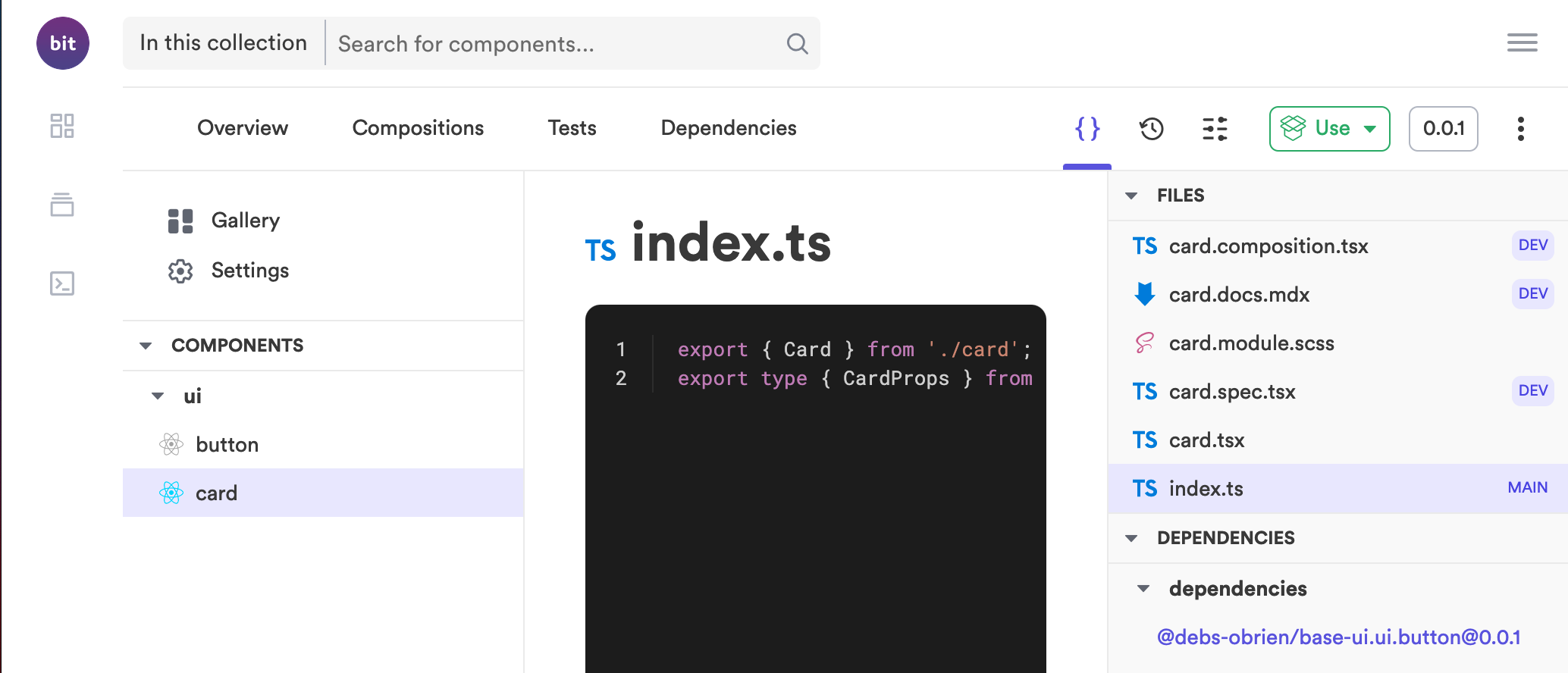
To add our button inside our card component we need to first import it. Bit doesn't allow using relative imports even though both components are in the same directory. The reason is that they might be in the same directory today but might not be tomorrow. This allows you to easily change your code directory structure without messing up your component imports, as your component becomes decoupled from the workspace directory structure. To import this component we need to find it's package name which we can see in the overview tab of the component.
Once we import it we can then use it inside our card component and we can also import the Button Props and extend our Card Props to also take in the Button Props.
import React from 'react';import { Button, ButtonProps } from '@my-scope/ui.button';import styles from './card.module.scss';
export type CardProps = {  /**   * a text to be rendered in the component.   */  text: string,} & ButtonProps;
export function Card({ text, buttonText, variation }: CardProps) { return ( <div className={styles.card}> {text} <Button buttonText={buttonText} variation={variation} /> </div> );}We can then update our compositions file to include the new props.
import React from 'react';import { Card } from './card';
export const BasicCard = () => (  <Card    text="hello from Card"    buttonText="hello from button"    variation="secondary"  />);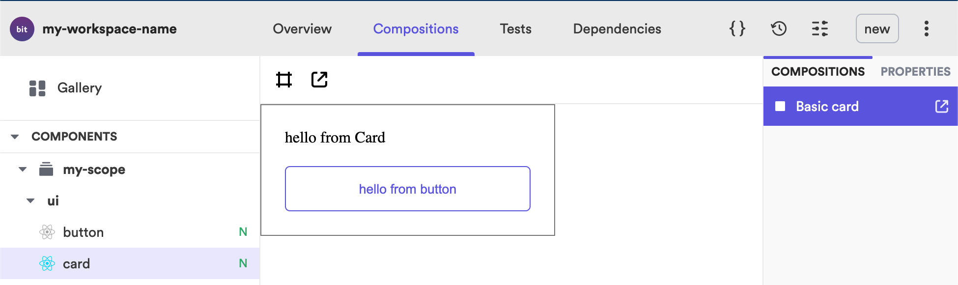
And we can also update our docs example with the added props of our button component.
```js live<Card text="hello from Card" buttonText="click me" variation="secondary" />```We can now see in our local workspace under the dependency tab that the our card component is consuming the button component. We can also see in the dependency that our graph now contains the two components and show the card depends on the button component.
We can of course create another compositions of our component using the primary variation by adding the word primary or omitting it as primary is the default value.
export const PrimaryCard = () => ( <Card text="hello from Card" buttonText="hello from button" />);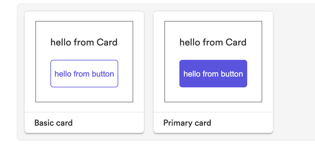
Creating a Remote Scope#
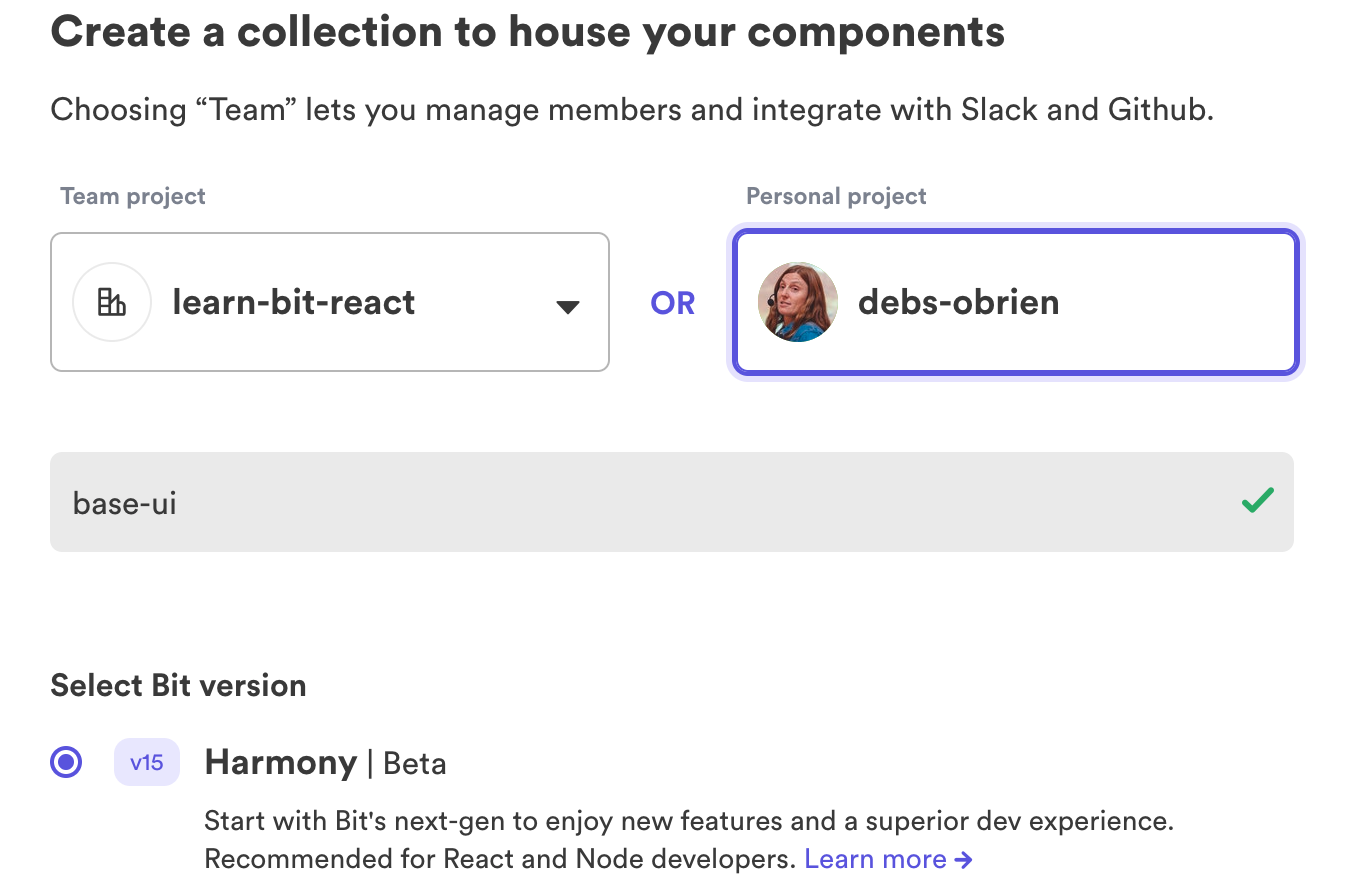
To export components we need to have a scope already setup. We can do this by going to bit.dev and creating an account or logging in if you have already setup an account.
bit loginOnce you have logged in you can then create a new scope. As our components are UI components they should probably be in a scope called base-ui so lets create that scope.
Updating your Default Scope#
Once we have created our scope we will need to update the scope name in the workspace.jsonc file to be same as your scope name. The scope name is made up of your organization or team name followed by the name of the scope.
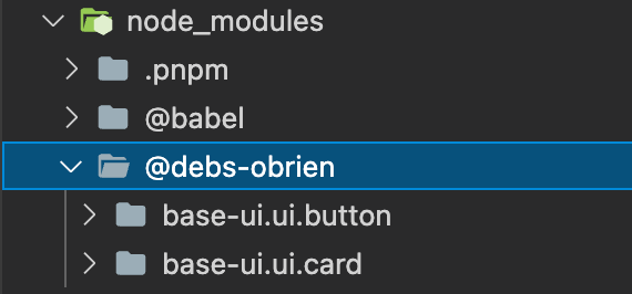
defaultScope: debs-obrien.base-uiLinking your Node Modules#
As we have changed the default scope we now need to make sure our node modules are linked correctly. We can do that with the bit link command.
bit linkNow in our node modules we can see we have these components under the correct scope.
We now need to manually update our import statements to reflect the changed scope name.
import { Button, ButtonProps } from '@debs-obrien/base-ui.ui.button';Versioning Components#
We can run the bit status command to see the status of our components.
bit statusWe can see we have missing dist folders and we will need them in order for our component to work correctly when exported. Lets fix that by running the bit compile command.
bit compileNow if we bit status it will show our components are ok meaning we are ready to tag our components using the bit tag command to create the first versions. Using the --all flag we can tag all the versions that have been modified meaning we don't have to tag each one individually. And we can add a message for our components version.
bit tag --all --patch --message "first version"Exporting Components#
Once the components have been tagged an all tests passed correctly you will now have a new version of your component and therefore can export the component using the bit export command.
bit exportOnce your components have been exported they will now be available on bit.dev and can therefore be consumed by other members of your team or available to anyone if you set the scope as a public scope.
You will also now see in the changelog tab that your component now has it's first version with the version message that you set when tagging it.
In the code tab of the card component you can see a list of dependencies under the code files and you can click from there to the components that it depends on which in our case is the button component.
Installing the Component#
We can use yarn or npm to install our component in another application. Let's create a simple React App.
npx create-react-app use-cardWe can then install the component using the yarn or npm install command followed by the package name of the component. To install components with a package manager the package manager needs to access your components like packages in a registry therefore you will need to configure your scope as a Scoped Registry. Details for this can be found under the use button and then selecting the install tab, as we want to install the component with a package manager.
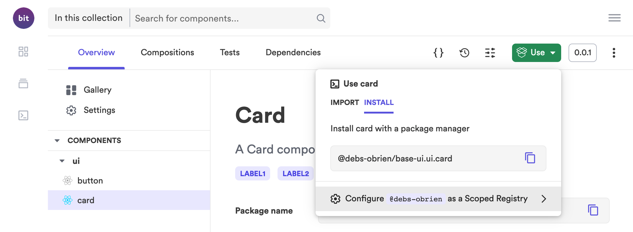
After you click on this link copy the code and paste it in the terminal to configure the scope as a scoped registry. You will only need to set this up once. After it is done you can then add your components from the Scoped registry/Bit cloud.
yarn add @debs-obrien/card.ui.cardNow in your node_modules folder you will see we have the component installed and therefore it can be used just like you would any other npm package. As we installed the card component that depends on the button component you will see that the button component was also installed.
If you look into the fils you will see that this component isn't a compiled component meaning the sass file is still a sass file and therefore if we want to use this in our React app we will need to include the packages it depends on which in this case is sass.
yarn add sassConsuming the Component#
Let's import it into our app.
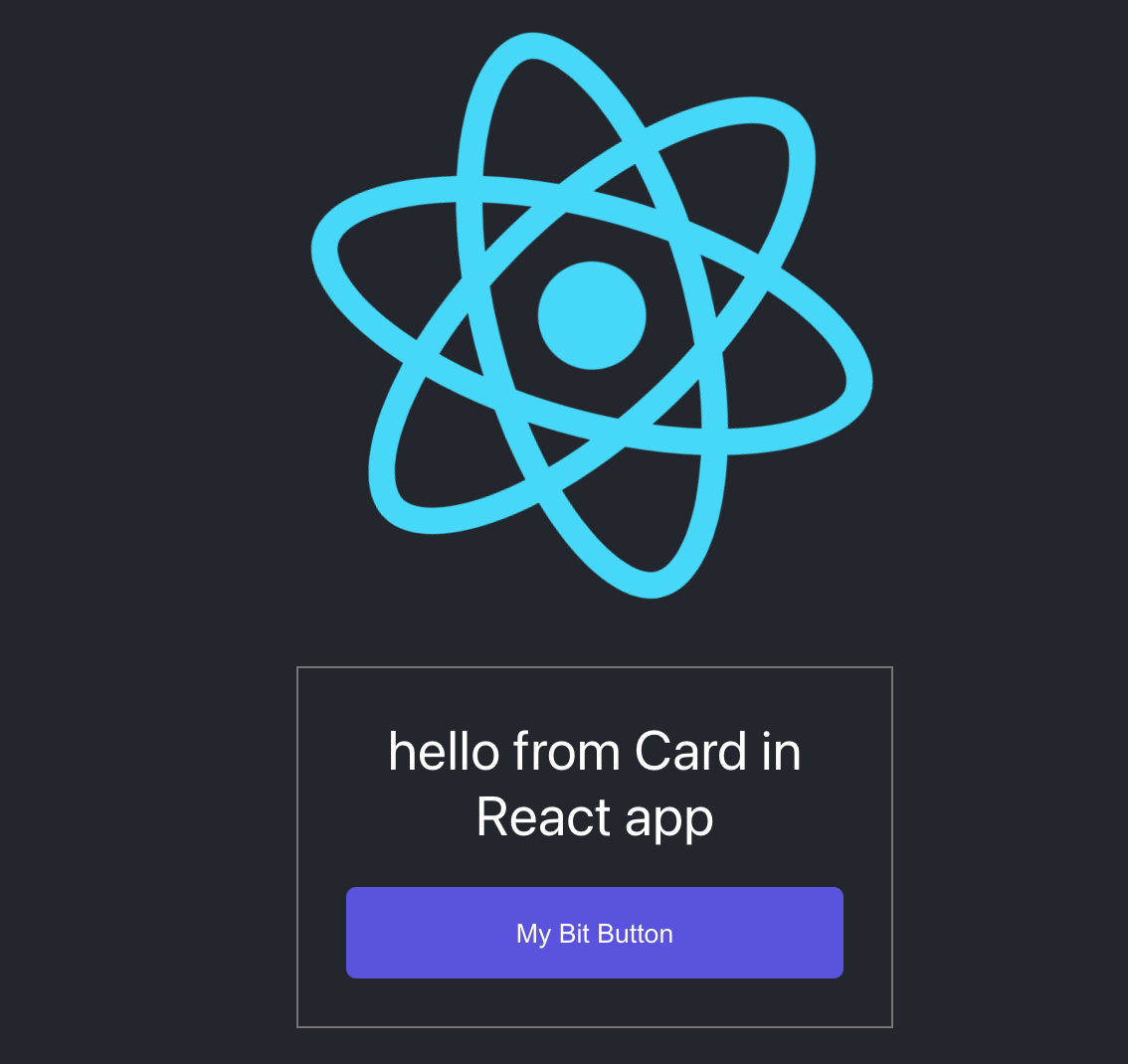
import logo from './logo.svg';import './App.css';import { Card } from '@debs-obrien/base-ui.ui.card';
function App() {  return (    <div className="App">      <header className="App-header">        <img src={logo} className="App-logo" alt="logo" />        <Card          importance="secondary"          buttonText="click here please"          text="My Bit Button"        />      </header>    </div>  );}
export default App;Start our React dev server so we can see our rendered component.
yarn startAnd there you have our beautiful card component rendered in our React application.
And that's it. Now it's time to start creating some more components and use them across your many applications and teams.
What's Next#
- Take a deeper look into Bit with our Building with Bit section
- Learn how to extend Bit and create your own component generator
- See why you should be Thinking in Components in our Architecture section